-
플렉스 박스 레이아웃(flex box layout)프로그래밍/HTML&CSS 2022. 9. 15. 20:25728x90
대부분의 웹 사이트는 수직으로 구성되어있어 수직으로는 쉽게 구성할 수 있으나, 그에 비해 수평으로의 구성은 구현 하기 쉽진 않다. 과거에는 수평 구성을 table, float, inline-block 으로 구성하였고 플렉스 박스 레이아웃 개념의 등장으로 수평 구성의 구현이 쉬워졌다.
display
플렉스 박스 레이아웃을 만들기 위해서는 웹 컨텐츠를 플렉스 컨테이너로 묶어주는 작업이 필요하다.
즉, 배치할 웹 요소가 있다면 그 요소를 감싸는 부모 요소를 만들고, 그 부모 요소를 플렉스 컨테이너로 만들어 감싸주는 것이다. 이때 display 속성을 사용하면 된다.
종류 설명 flex 컨테이너 안의 플렉스 항목을 블록 요소로 배치 inline-flex 컨테이너 안의 플렉스 항목을 인라인 요소로 배치 flex-wrap
flex-wrap 속성은 플렉스 컨테이너 너비보다 많은 플렉스 항목이 있어 너비의 여유가 없을 경우 플렉스 요소의 위치를 다음줄로 넘길지 여부를 설정한다.
종류 설명 nowrap 기본 설정 값으로 플렉스 요소가 다음줄로 넘어가지 않고 요소의 너비를 줄여 한 줄에 배치 wrap 플렉스 요소가 여유공간이 없다면 다음줄로 넘김 wrap-reverse 플렉스 요소가 여유 공간이 없다면 다음줄로 넘김. 단, 아래쪽이 아닌 윗줄로 넘김 <!DOCTYPE html> <html lang="en"> <head> <meta charset="UTF-8"> <meta http-equiv="X-UA-Compatible" content="IE=edge"> <meta name="viewport" content="width=device-width, initial-scale=1.0"> <title>flex</title> <style> .container{ width: 500px; height: 80px; margin: 120px auto; border: 3px solid red; display: flex; } #container1{ flex-wrap: wrap; } #container2{ flex-wrap: nowrap; } #container3{ flex-wrap: wrap-reverse; } .container > div{ width: 200px; border: 1px solid black; background-color: gold; } h1{ font-size: 21px; font-weight: bold; padding: 12px; } </style> </head> <body> <div id="container1" class="container"> <div id="box1"><h1>1</h1></div> <div id="box2"><h1>2</h1></div> <div id="box3"><h1>3</h1></div> </div> <div id="container2" class="container"> <div id="box1"><h1>1</h1></div> <div id="box2"><h1>2</h1></div> <div id="box3"><h1>3</h1></div> </div> <div id="container3" class="container"> <div id="box1"><h1>1</h1></div> <div id="box2"><h1>2</h1></div> <div id="box3"><h1>3</h1></div> </div> </body> </html>
flex-wrap 예제 justify-content
플렉스 요소의 수평 방향 정렬 방식을 설정한다.
종류 설명 flex-start 기본 설정값으로 앞쪽 부터 배치 flex-end 뒤쪽 부터 배치 center 가운데로 배치 space-between 요소들 사이에 여유 공간을 두고 배치 space-around 앞, 뒤 그리고 요소들 사이에 모두 여유공간을 두고 배치됨 <!DOCTYPE html> <html lang="en"> <head> <meta charset="UTF-8"> <meta http-equiv="X-UA-Compatible" content="IE=edge"> <meta name="viewport" content="width=device-width, initial-scale=1.0"> <title>flex</title> <style> h2,h3{text-align: center;} .wrapper{ width: 500px; height: 50px; margin: 0 auto; display: flex; border: 3px solid red; } .wrapper > div{ width: 100px; border: 2px solid black; background-color: gold; } p{text-align: center;} #container1{ justify-content: flex-start; } #container2{ justify-content: flex-end; } #container3{ justify-content: center; } #container4{ justify-content: space-between; } #container5{ justify-content: space-around; } </style> </head> <body> <h3>justify-content : flex-start</h3> <div id="container1" class="wrapper"> <div><p>1</p></div> <div><p>2</p></div> <div><p>3</p></div> </div> <h3>justify-content : flex-end</h3> <div id="container2" class="wrapper"> <div><p>1</p></div> <div><p>2</p></div> <div><p>3</p></div> </div> <h3>justify-content : center</h3> <div id="container3" class="wrapper"> <div><p>1</p></div> <div><p>2</p></div> <div><p>3</p></div> </div> <h3>justify-content : space-between</h3> <div id="container4" class="wrapper"> <div><p>1</p></div> <div><p>2</p></div> <div><p>3</p></div> </div> <h3>justify-content : space-around</h3> <div id="container5" class="wrapper"> <div><p>1</p></div> <div><p>2</p></div> <div><p>3</p></div> </div> </body> </html>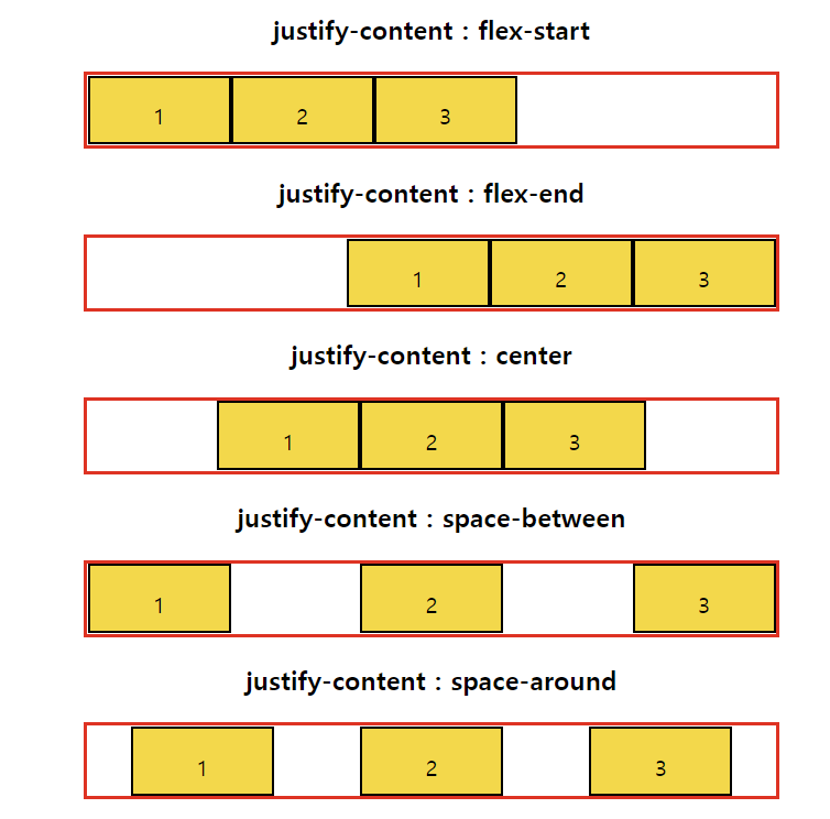
justify-content 예제 align-items
플렉스 요소의 수직 방향 정렬 방식을 설정한다.
종류 설명 stretch 기본 설정 값으로 플렉스 요소의 높이가 컨테이너의 높이와 같게 변경된 뒤 연어어 배치 flex-start 플렉스 컨테이너의 위쪽에 배치 flex-end 플렉스 컨테이너의 아래쪽에 배치 center 플렉스 컨테이너의 가운데에 배치 baseline 플렉스 컨테이너의 기준선에 배치 <!DOCTYPE html> <html lang="en"> <head> <meta charset="UTF-8"> <meta http-equiv="X-UA-Compatible" content="IE=edge"> <meta name="viewport" content="width=device-width, initial-scale=1.0"> <title>flex</title> <style> h2, h3{ text-align: center; } .wrapper{ width: 500px; height: 150px; margin: 0 auto; display: flex; border: 3px solid red; } .wrapper > div{ width: 100px; border: 2px solid black; background-color: gold; } #container1{ align-items: stretch; /*기본*/ } #container2{ align-items:flex-start; /*contents 크기만큼 줄어들고 위로 붙음*/ } #container3{ align-items:flex-end; /*contents 크기만큼 줄어들고 아래로 붙음*/ } #container4{ align-items:center; /*contents 크기만큼 줄어들고 가운데로 붙음*/ } #container5{ align-items:baseline; /*contents 크기만큼 줄어들고 기준선으로 정렬*/ } </style> </head> <body> <h3>align-items : stretch</h3> <div id="container1" class="wrapper"> <div><p>1</p></div> <div><p>2</p></div> <div><p>3</p></div> </div> <h3>align-items : flex-start</h3> <div id="container2" class="wrapper"> <div><p>1</p></div> <div><p>2</p></div> <div><p>3</p></div> </div> <h3>align-items : flex-end</h3> <div id="container3" class="wrapper"> <div><p>1</p></div> <div><p>2</p></div> <div><p>3</p></div> </div> <h3>align-items : center</h3> <div id="container4" class="wrapper"> <div><p>1</p></div> <div><p>2</p></div> <div><p>3</p></div> </div> <h3>align-items : baseline</h3> <div id="container5" class="wrapper"> <div><p style="font-size: 14px;">1</p></div> <div><p style="font-size: 27px;">2</p></div> <div><p style="font-size: 19px;">3</p></div> </div> </body> </html>
align-items 예제 align-self & order
align-self 속성은 개별적으로 플렉스 요소마다 서로 다른 align 속성값을 설정한다. order는 플렉스 요소들의 순서를 바꿀 수 있다.
<!DOCTYPE html>
<html lang="en">
<head>
    <meta charset="UTF-8">
    <meta http-equiv="X-UA-Compatible" content="IE=edge">
    <meta name="viewport" content="width=device-width, initial-scale=1.0">
    <title>flex</title>
    <style>
        h2{text-align: center;}
        #container{
            width: 500px;
            height: 150px;
            margin: 0 auto;
            display: flex;
            border: 3px solid red;
            align-items: center;
        }
        #container > div{
            width: 100px;
            border: 3px solid black;
            background-color: gold;
        }
        #box3{
            align-self: flex-end;
        }
        #box1{
            order: 2;
        }
        #box2{
            order: 3;
        }
        #box3{
            order: 1;
        }
    </style>
</head>
<body>
    <div id="container">
        <div id="box1"><p>1</p></div>
        <div id="box2"><p>2</p></div>
        <div id="box3"><p>3</p></div>
    </div>
</body>
</html>
align-self & order 예제 728x90