프로그래밍/HTML&CSS
border-radius
하와이블루
2022. 9. 3. 09:00
728x90
border-radius는 박스 모델의 테두리를 둥글게 만드는 방법으로 이 속성을 이용하면 원의 반지름을 이용한 둥근 정도를 표현한다.
border-radius: <크기> | <백분율>
border-radius: top-left-x top-right-x bottom-right-x bottom-left-x /
	       top-left-y top-right-y bottom-right-y bottom-left-y
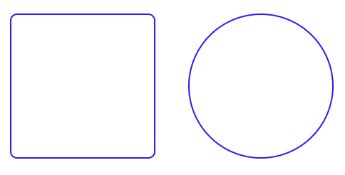
border-radius 속성을 사용하면 이미지를 원 형태로 만들 수 도 있다.
이미지 요소의 너비와 높이를 똑같이 하고 border-radius의 반지름 값을 너비나 높이의 50%로 지정하면 원이 된다.
예를 들어 300px의 박스가 있다고하면 150px이나 50%로 적용하면 원으로 표현된다.
<!DOCTYPE html>
<html lang="en">
<head>
    <meta charset="UTF-8">
    <meta http-equiv="X-UA-Compatible" content="IE=edge">
    <meta name="viewport" content="width=device-width, initial-scale=1.0">
    <title>둥근테두리</title>
    <style>
        div{
            width: 200px;
            height: 200px;
            margin: 20px;
            display: inline-block;
            border: solid 2px blue;
        }
        .a{
            border-radius: 10px;
        }
        .b{
            width: 200px;
            height: 200px;
            border-radius: 50%;
        }
    </style>
</head>
<body>
    <div class="a"></div>
    <div class="b"></div>
</body>
</html>
728x90